For the complete documentation index, see llms.txt. This page is also available as Markdown.

Matrix Configuration

Matrix Configuration for Wave

Create A New Matrix

The Matrix Configuration page allows users to define the structure and layout of a matrix. You can access this page in different ways depending on your environment:

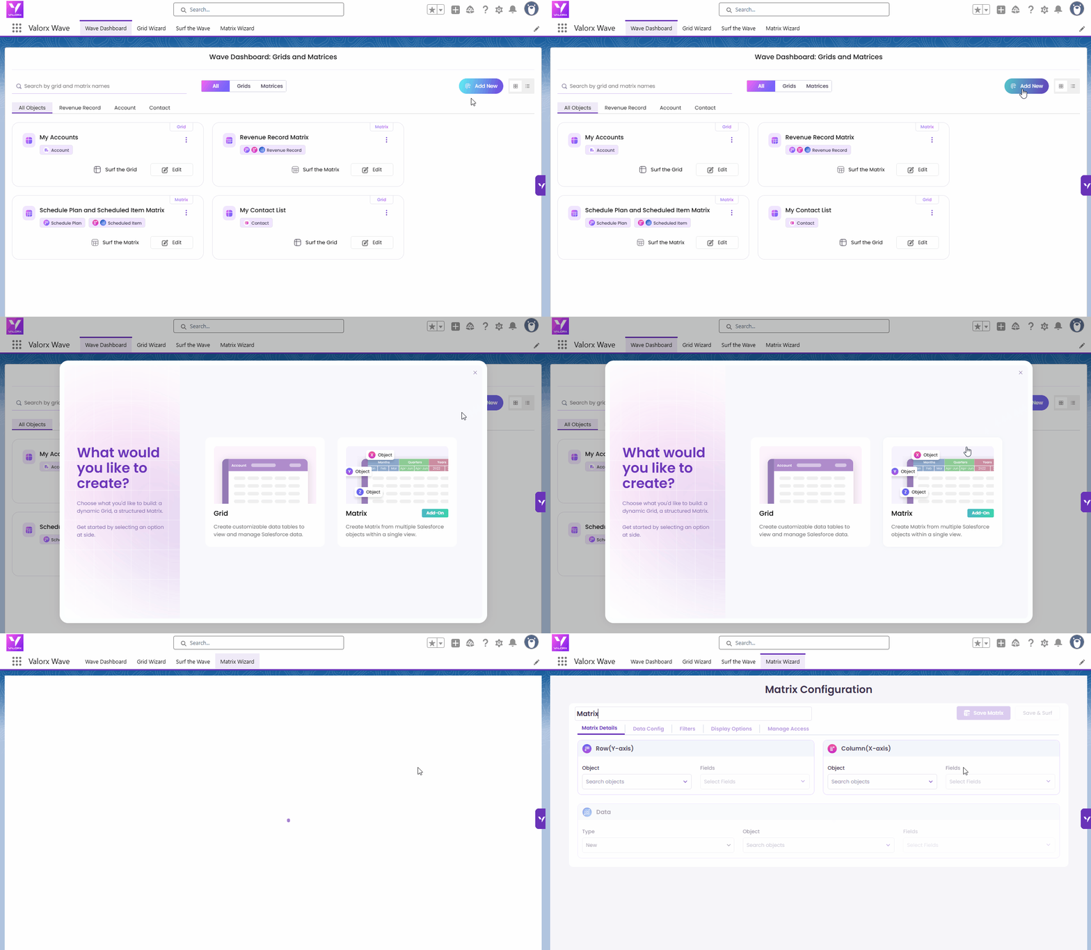
  • Wave Embedded: Access Matrix Configuration by clicking the Add New button and selecting Matrix, or directly clicking the Matrix Wizard button from the Wave Dashboard.

    Wave Embedded - Add New Matrix

  • Wave Extension: Go to the Matrix screen and click Create New Matrix to begin configuring a new matrix.

    Wave Extension - Create New Matrix

Notes: This page is only for Designer or Admin role.

1. Matrix Details

The Matrix Details section lets Designers configure the structure and data sources of the matrix.

Matrix Title

The title is automatically generated based on the selected Row and Column objects, followed by the word “Matrix” (e.g., Account and Opportunity Matrix). Designers can manually rename the Matrix title as needed.

Layout Configuration

Define the key components of your matrix by selecting objects and fields for each axis:

1. Row (Y-axis) :

1

Choose your row object and fields

Select the Salesforce object that drives your rows, then pick the fields you want to display.

2

Optional: configure how those fields behave

Click Configure to control visibility, editing, and totals per field.

Option
What it does

Hidden

Hides the field from view

Read Only

Prevents editing of the field

Total

Shows a total for the field

Actions

Sets available actions for the field

The Configuration button shows a checkmark once settings are saved.

2. Column (X-axis) :

1

Choose your column object and field

Pick the object and a single field for columns. Supported types: Date, Lookup, and Picklist.

2

Optional: enable 2-level column headers New

Check Enable 2-level X-axis headers to group columns under a second level of headers.

Once enabled, go to Display Options → Layout to choose how the two levels look:

Setting
What to choose

Style

Hierarchical (default) — Level 1 on top, Level 2 nested below. Or Inline — both levels merged into one header.

Separator

When Inline: Hyphen (default), Space, Pipe, or Comma — controls how the two levels are joined.

Display order

Show Level 1 then Level 2, or reverse the order.

Hierarchy

For Hierarchical style only — choose which level sits on top.

Note: Supported field types for the X-Axis are Date, Lookup, and Picklist.

3. Data (Measure):

Choose what fills the matrix cells

Set the object and fields that populate the values inside your matrix.

Type
When to use it

Existing

Uses the same object as your X-axis. Good for simple matrices.

New

Lets you pick a different object — useful for two- or three-object matrices.


2. Data Config

The Data Config section empowers Designers to shape how data is structured, calculated, and presented in the matrix. It includes tools to:

Together, these settings offer powerful flexibility to tailor the matrix to your business needs and user workflows.

Data Config

Configure Measure

The Configure Measure section allows Designers to define how data is calculated, displayed, and edited within the matrix. It includes settings for aggregating data, controlling how changes are saved, and customizing the behavior and appearance of each field.

Data Aggregation

Choose how values are pulled from the dataset.

  • Combine Value – Aggregates all related records using functions like Sum, Average, or Count.

  • First Match – Displays the value from the first matching record.

Save Options (only for Combine Value)

Decide how edited values are distributed across records.

  • Weighted Average

  • Equal Distribution

Data Fields

The Data Fields section lets Designers customize how each field behaves and appears within the matrix. These settings control display preferences, input rules, formatting, default values, and field behavior during runtime.

Field Name

  • Click to rename the field (must be unique; max 25 characters).

  • Use Revert to reset the name to the system default.

Edit the field name

Group Functions(for Combine Value)

Define how data is summarized when combining multiple records:

  • Sum – Adds up numeric values.

  • Average – Calculates the average value.

  • Count – Counts the total number of records.

  • Required

    • Marks a field as mandatory. Users must enter a value before adding or saving a record.

Dynamic Matrix Field

Controls whether the field appears in the Dynamic Measures tab at runtime.

  • Checked – The field appears in the Dynamic Measures tab in runtime and users can toggle its visibility as needed.

  • Unchecked – The field appear in the Dynamic Measures tab, but users cannot toggle its visibility during runtime.

Dynamic Matrix Field

Hidden Field

Hides the field from the matrix view by default.

  • If a field is both Hidden and a Dynamic Matrix Field, it stays hidden initially but can be added by the user at runtime through Dynamic Measures.

Field Visibility Scenario:

Hidden
Dynamic Matrix Field
Matrix View
Dynamic Measures

❌ Not shown

✅ Available (unchecked)

❌ Not shown

❌ Not available

✅ Shown

✅ Available

✅ Shown (fixed)

❌ Not available

Configure the Hidden Field and Dynamic Matrix Field

Total

The Matrix Totals feature allows you to display automatic totals directly within your matrix grid, giving you instant insights into your data without additional calculations.

  • Configurable Display: Choose up to three columns to show totals during configuration.

  • Instant Calculation: Totals are automatically generated based on the values in your data columns

Display Behavior

  • Show Totals Visibility: The Show Totals checkbox is hidden if:

    • The maximum column limit is reached, or

    • The selected field in Data Config is non-numeric.

  • Default Position: The Totals column is pinned to the right side by default.

  • User Movement: If the user moves the Totals column to the left (using the Move to Left icon), it appears between the Y-axis columns and the historical columns and becomes unpinned.

  • Toggling: Users can toggle between the two positions (pinned right vs. unpinned left).

  • Refresh Behavior: The Totals column returns to its default right-pinned position when the user refreshes or re-runs the matrix.

Notes — When the matrix is first rendered and historical columns are hidden, their data isn’t initially loaded. As a result, the Totals column doesn’t include hidden historical data at first. Once the user expands the hidden historical columns, the data is fetched, and from that point onward, the Totals column reflects historical data, even if those columns are later collapsed again.

Matrix Total

Read-Only

  • Prevents users from editing the field in the matrix. Display only.

Format Cell

Applies to Number, Currency, and Decimal fields.

  • Decimal Control – Set number of decimal places.

  • Unit Scaling – Display values in thousands, millions, etc.

Example:

  • Field value: 1.345

  • Decimal Places: 3

  • Unit Scaling: Millions

  • Displayed as: 1.345 → Represents 1,345,00

Configure Format Cell

Default Value

Allows setting predefined values for new records only. These values are not applied to existing records.

Configure Default Value

Detail Layout

Use the Detail Layout settings to control how users view and edit matching records within the matrix during runtime.

Detail Layout

Show Detail View Toggle

Enable or disable the Detail View in runtime.

  • Enabled – Users can access the DDV to view and edit records.

  • Disabled – The DDV will be hidden from runtime.

Cell Behavior Options

Set how users can edit records:

Option
Description

Both

Users can edit inline or open the DDV.

Edit in DDV only

Records can only be edited in the detail view.

Edit Inline only

Users edit directly in the matrix grid.

Matrix Detail View in Runtime

Records Grid and Detail View

View and manage matching records in a records grid. Click a record to open its detailed layout to review and edit.

  • Configure Record Grid Customize the fields shown in the record grid:

    • Add or remove fields.

    • Rearrange column order to prioritize important data.

  • Configure Detail Layout Design how fields appear in the record detail view:

    • Add or remove fields.

    • Rearrange layout to suit your workflow.

Matrix Detail View Layout

Matrix Orientations

Choose how your data is arranged in the matrix by selecting an orientation that best fits your analysis:

  • Horizontal Orientation – Fields from the data object are displayed as columns.

  • Vertical Orientation – Fields from the data object are displayed as rows.

This flexibility helps you customize the matrix layout based on the structure of your data and how you prefer to analyze it.

Matrix Orientation

Horizontal Orientation in Runtime:

Horizontal Matrix Orientation in Runtime

Vertical Orientation in Runtime:

Vertical Matrix Orientation in Runtime

3. Timeline – Matrix Configuration (Visible Only for Date Fields)

This tab lets you choose between Straight Line and Telescope views to display data over time.

Visible only when a Date field is selected for the Column (X-axis)

The Timeline tab allows Designers to display data over time using structured or dynamic intervals. This configuration becomes available only when a Date field is selected for the column.

Timeline

Year Type

Select how the matrix interprets and displays year-based intervals:

  • Fiscal – Aligns X-axis date buckets with the fiscal calendar configured in your Salesforce org. If fiscal settings are not configured in your org, the matrix automatically falls back to calendar-based timeline generation.

  • Calendar – Generates timeline buckets based on standard calendar dates from the configured start date.

In Runtime:

Fiscal Year
Calendar Year

This setting applies to both Straight Line and Telescopic configurations across weeks, months, quarters, and years.

Partial Fiscal Periods: If the matrix start date falls mid-fiscal period, the first bucket covers from the start date to the end of that fiscal period. Subsequent buckets follow the full fiscal calendar.

Tooltip: Hover over any X-axis column header to see the exact start and end date for that bucket. This is especially useful for partial fiscal periods.

Fiscal Year Labels in Matrix Date Headers

When your organization uses a Custom Salesforce Fiscal Year, the labels displayed in X-axis Matrix date-based column headers follow the naming and labeling conventions configured in Salesforce Fiscal Year settings. The behavior varies depending on the selected date granularity.

Year

Year headers display the numeric year extracted from the Salesforce Fiscal Year name.

Examples

Salesforce Fiscal Year Name
Matrix Header

FY2027

2027

Fiscal 2026

2026

If the fiscal year name is updated in Salesforce, the Matrix header automatically reflects the new value after the next refresh.

Quarter

Quarter headers are always displayed as sequential quarter numbers (1–4), regardless of the Salesforce Quarter Name Scheme configuration.

Salesforce Quarter Name Scheme
Matrix Header

Number by Year

1, 2, 3, 4 (According to Period Number)

Custom Quarter Names

1, 2, 3, 4

Quarter numbering is derived from the fiscal period sequence and displays consistently across all fiscal year configurations.

Month (Period)

Month headers are determined by the configured Period Name Scheme.

Salesforce Period Name Scheme
Matrix Header
Status

Standard Month Names

January, February, March, etc.

✓ Supported

Number by Year

Month names derived from fiscal position within the fiscal year

✓ Supported

Number by Quarter

Month names derived from position within the quarter and fiscal year

✓ Supported

Custom Period Names

Custom labels defined in Salesforce (for example, Pipeline, Booking, or Intake) when using MMM or MMMM date mask tokens

✓ Supported

Week

Week headers follow the configured Week Label Scheme and week prefix.

Salesforce Week Label Scheme
Matrix Header Example
Notes

Number by Year

WK 1 2027, WK 2 2027, ..., WK 52 2027

Week numbers are unique across the fiscal year.

Number by Quarter

WK 1, WK 2, ...

Week numbering restarts at the beginning of each fiscal quarter.

Number by Period

WK 1, WK 2, ...

Week numbering restarts at the beginning of each fiscal period.

Known Limitation

Choose Timeline Methods

Straight Line

Displays data chronologically based on the selected interval.

Timeline - Straight line Monthly
Timeline - Straight line Quarterly

Telescope

Enables a dynamic, rolling time window (e.g., Past 3 Months, Current Quarter, or All Years), ideal for trend analysis.

  • 0 is allowed in Telescoping Timeline only if at least one of the three values (Months, Quarters, Years) is greater than 0 or set to All.

  • 0 is not allowed in Relative Date configurations.

  • Supported week-based combinations include: Weeks → Quarters → Years and Weeks → Months → Quarters → Years.

Timeline - Telescoping for 3 months and 3 quarters

Date Format

Controls how dates are displayed on the Timeline X-axis. This does not affect the underlying date values.

  • Select a Date Format from the dropdown under Choose Intervals.

  • Each option includes a sample display (e.g., MM/DD/YYYY – 12/01/2025) to help you choose the correct format.

  • The selected format is applied after saving the Timeline configuration.

  • Date display may adapt based on user locale.

Timeline Method

Date Formats by Interval

Daily (Exact)

  • Locale-Specific (Default) – Displays date based on user locale Example (German locale): 24.12.2023 or 4.1.2023

  • MM/DD/YYYY – 12/01/2025

  • DD/MM/YYYY – 01/12/2025

  • YYYY-MM-DD – 2025-12-01

Weekly

  • Wk {WW}, YYYY (Default) – Wk 49, 2025

  • YYYY-W{WW} – 2025-W49

  • {Start Date} – {End Date} (Locale-Based) – 12/01/2025 – 12/07/2025 (US locale)

Monthly

  • MMM YYYY (Default) – Dec 2025

  • MMMM YY – December 25

  • YYYY-MM – 2025-12

Quarterly

  • Q{Q} YYYY (Default) – Q1 2026

  • YYYY-Q{Q} – 2026-Q1

  • {MMMM YY} – {MMMM YY} – December 25 – February 26

Yearly

  • {MMM YYYY} – {MMM YYYY} (Default) – Dec 2025 – Nov 2026

  • YYYY – 2026

Notes:

  • Locale-based formats automatically adjust based on the user’s regional settings.

  • Weekly and range-based formats display start and end dates according to the selected locale.

Custom Date Format

Select Custom from the Choose Date Format dropdown to define your own date format for X-axis column headers. A Custom Format input field appears where you can type a format using supported tokens.

A live preview of the formatted date is displayed on the right side of the input field as you type.

The following tokens, labels, and separators are supported:

Tokens

Token
Description

DD

Day of month

DDD

Abbreviated day name (e.g., Wed)

DDDD

Full day name (e.g., Wednesday)

MM

Month (numeric)

MMM

Abbreviated month name

MMMM

Full month name

YY

Two-digit year

YYYY

Four-digit year

Note: Custom Format tokens are case-sensitive. Use uppercase exactly as shown above; lowercase entries (e.g., ddd) will trigger a validation error.

Labels

Label
Description

{W}

Week

{Q}

Quarter

Separators

- \ / , . : ; ' \ ~ ! ( ) [ ]`

Examples

Custom Format
Result

DD MMM YYYY

01 Jul 2026

MM/DD/YYYY

07/01/2026

DDD, DD MMM YYYY

Wed, 01 Jul 2026

DDDD, MMMM DD, YYYY

Wednesday, July 01, 2026

Custom format is available for both Straight Line and Telescopic configurations.


Time Horizon

  • Absolute: Pick a fixed start date using a calendar.

  • Relative: Dynamically define time ranges using customizable logic.

    • Default: Uses "is on or before" with a default value of 1 month.

    • Dual Parameters: Optionally include both "is on or before" and "is on or after" to define a precise rolling range.

  • The following are the maximum allowed values for each relative calendar interval:

    Interval
    Max Value

    Days

    365

    Weeks

    52

    Months

    120

    Quarters

    60

    Fiscal Quarters

    60

    Years

    15

    Fiscal Years

    15

    This ensures consistent and accurate results when defining relative start dates.

Start Date Configuration

Historical View

Easily track and compare your past data with the new Historical View option.

  • Show Past Period (Relative only): Display historical data for up to 18 months.

  • Hide Past Month by Default: Past data is hidden initially; click the icon to toggle visibility.

  • Always Visible: Keep selected data visible, even when hidden, with options M, M-1, or M-2.

  • Read Only: Lock past data to prevent any edits.

This feature helps you analyze trends over time while keeping your data secure and organized.

Special Rules

Relative Time Horizon

  • If Straight Line Interval = Exact Date → Historical options are not supported.

  • If Timeline Method = Telescope → Telescoping starts from the current period, and Historical data will be monthly only.

Absolute Time Horizon

  • If Straight Line Interval = Exact Date → Historical options are not supported.

  • If Timeline Method = Telescope → Historical options are not supported.

Historical View

4. Filters – Record Selection

The Record Selection feature lets you filter and refine the data shown in the Matrix based on the Row (Y-axis) and Column (X-axis) object selections.

Accessing Record Selection

Click the Filter button in the Matrix to open the Record Selection screen. You’ll see two sections:

  • Initial Selection – For the first object.

  • Subsequent Selection – For the second object.

If neither selection has been configured, these sections appear greyed out and you will not be able to run the Matrix.

Filters - Record Selection

Switch Axis

A toggle button allows you to switch the Row and Column object positions. This can help you adjust how records are filtered and presented.

Configuring Record Selection

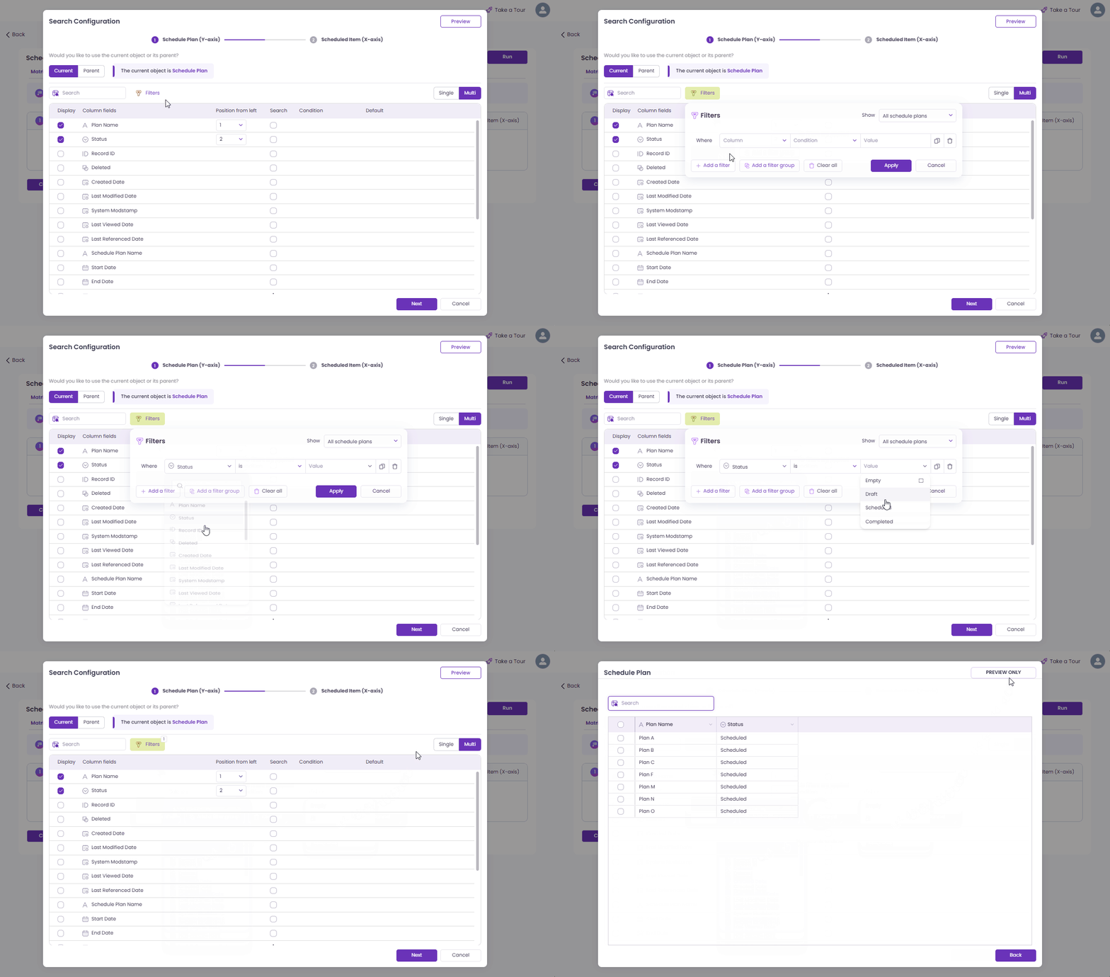
Clicking Configuration opens the Search Configuration window, where you define how records are searched and filtered.

1

Choose Object Type

You can choose the source object for the selection:

  • Current Object (default): The object used when the Matrix was created.

    Current Object

  • Parent Object: A parent of the current object. Selecting this updates the available fields based on the object relationship.

    Parent Object
2

Select Object Fields

Once the object is selected:

  • Use the search bar or scroll to locate fields.

  • Select fields to display in the record selection popup.

  • Reorder selected fields — the order affects how fields appear during record selection.

  • Selected fields are marked with ✔️ and assigned a position number.

Select Object Fields
3

Filters and Filters (Current Object)

The Filters section allows you to define how records are filtered before being displayed in the Matrix.

When a Parent Object is selected as the initial (Y-axis) object, an additional button—Filters (Current Object)—will appear. This option allows you to apply filters on the child (current) records based on the parent records you've selected.

  • Filters: Use filters to narrow down the records for the selected object (either the Current Object or its Parent

  • Filters (Current Object): This option appears only when you’ve selected a Parent Object. It lets you filter child records based on the values from the linked parent record.

Apply filters to the object fields

This dual-filter setup provides greater control over what data appears in the Matrix, especially in parent-child object relationships.

4

Add Search Filters (Optional)

If you want to pre-filter data:

  • Enable the Search checkbox for a field.

  • Choose a condition (e.g., Starts With, Equals).

  • Enter a default value.

Add Search Filters

When Search is enabled for a field, it also enables filtering for Standard Users in the Record Selection window. This allows Standard Users to filter records based on those fields during Matrix runtime.

5

Choose Record Selection Mode

Decide how many records users can select during runtime:

  • Single – Only one record can be selected.

  • Multi – Multiple records can be selected.

Record selection mode
6

Linking and Filtering Between Objects (Subsequent/X-Axis Selection)

After configuring the Initial Selection (Y-axis object), click Next to set up the Subsequent Selection (X-axis object).

By default, the X-axis is linked to the Y-axis. This means the records available for the X-axis are filtered based on what you selected in the Y-axis.

  • For example, if the Y-axis is Schedule Plan and the X-axis is Scheduled Items:

    • Linked: Only Scheduled Items related to the selected Schedule Plan records will appear.

    • Unlinked: All Scheduled Items will be shown, regardless of which Schedule Plan records were selected.

You can choose to unlink the objects if you prefer to configure filters independently for each axis.

Link record selection
7

Show Selection Toggle

Click Show Selection to display the list of fields for the Subsequent Selection (X-axis object). This enables a second record selection window—allowing users to choose records based on the X-axis object, similar to how the Y-axis (Initial Selection) works.

If Show Selection is disabled, users will only see the record selection window for the Y-axis object.

Once enabled, the steps are the same as the initial selection as the above steps (Step 1 to Step 5).

Show selection
8

Final Step – Submit

  • Review your configuration.

  • Click Submit to apply the filter settings and return to the Matrix.

Final step

Record Selection Screen After Filter Configuration Once the Designer has configured the Filters, the Record Selection section updates to display only the records that match the defined criteria.

Record Selection Screen


5. Display Options

The Display Options section provides Designers with powerful tools to control the visual presentation and organization of Matrix data. It includes four configuration tabs: Conditional Formatting, Sort, Column Group, and Layout — giving you greater flexibility to customize how your data is grouped, sorted, styled, and displayed.

Conditional Formatting

Customize how your Matrix data is visually represented using separate formatting settings for the Y-Axis and Data Fields:

Y-Axis Formatting Apply one of the following styles to values on the Y-axis:

  • Single – Apply formatting to individual values.

  • Group – Apply shared formatting across grouped values.

  • Color Bar – Use color gradients or bars to visually represent value intensity.

Data Field Formatting Apply the same set of formatting options to any Data field:

  • Single, Group, or Color Bar – enabling contextual formatting to highlight trends or patterns in your data.

This separation allows for precise and flexible visual enhancements based on your analysis needs.

Conditional Formatting

Known Issue

Issue: In Matrix Configuration Mode, applying Conditional Formatting using ‘is any of’ or ‘is none of’ conditions on Date or DateTime fields causes the Matrix to fail to render completely. Users cannot see or interact with the Matrix.

Workaround: Open the Matrix in Matrix Configuration Mode and delete the Conditional Formatting rule applied to the Date/DateTime field under Display Option section.

ℹ️ Recommendation: Until the issue is fixed in an upcoming release, avoid applying ‘is any of’ or ‘is none of’ conditions on Date/DateTime fields in Conditional Formatting.

Sort

The Sort tab enables users to define multiple sorting conditions for Matrix objects on the Y-axis.

  • Supports full flexibility with no limit on the number of sort levels.

  • Works similarly to sorting behavior in Wave Grid.

  • Lets Designers organize complex data views exactly as needed for clarity and comparison.

Sort

Column Group

The Column Grouping tab allows Designers to visually organize Y-axis fields into grouped sections. This helps users quickly understand how related data are structured within the Matrix. Learn more about configuring column group here.

Layout

The Layout tab allows Designers to customize the appearance of the Matrix for better readability and a polished presentation.

Column Freeze

Designers can freeze the Y-axis column to either the left or right side of the Matrix. This ensures important reference columns remain visible while scrolling horizontally.

Row Height

Choose from predefined row height options — Short, Medium, Tall, or Extra Tall — to improve data visibility. You can also enable Auto Size Column to automatically adjust the width based on content.

For more details, see Auto Size Columns.

Resizable Columns

You can resize both Y-axis and Data-axis headers to fit your layout needs.

  • Expanded View: Click Expand to open a resizing dialog for precise adjustments. Any changes made can be saved as layout preferences.

  • Smart Display: Header text wraps neatly (up to three lines for Y-axis and two for Data-axis) and automatically hides icons when space is limited.

  • Consistent Formatting: Progressive font and margin adjustments with “...” truncation maintain a clean, professional appearance.

These layout options provide greater flexibility and control, helping you design clear, well-structured Matrices even for large or dense datasets.


6. Manage Access

The Manage Access settings allow Admins and Designers to control who can access the Matrix and what actions Standard Users are allowed to perform at runtime. This section contains two key tabs: Users and Matrix Control.

Users Tab

Use this tab to define which users can access the Matrix.

Allow All Users

  • Grants access to all users.

  • No further configuration is needed.

Select Specific Users

  • Restricts access to only selected users.

🔔 Note: If “Allow All Users” is selected, everyone automatically gains access.

  • Allow All Users – Grant access to everyone.

  • Selected Users – Restrict access to only selected users.

Manage Access

✅ To Assign Access to Specific Users:

  1. Choose Selected Users from the access options.

  2. Click the Add More button. A Select Users window will appear.

  3. Search for users using the search bar or scroll through the list.

  4. Select the desired users.

  5. Click Assign to grant them access.

🔔 If you choose Allow All Users, no further action is needed—all users will automatically have access.

Manage User Access

To remove a user's access to a Matrix, click the trash icon (🗑️) under the Action column, then click Save to apply the changes.

Remove User Access

Matrix Control Tab

This tab provides fine-grained control over how Standard Users can interact with the grid at runtime.

Field Permissions

  • ✅ Allow adding and removing Y-axis fields

  • ✅ Allow adding and removing Data fields

  • ✅ Allow rearranging fields Y-axis and Data fields

Record Permissions

  • ✅ Allow adding Data record

Display Options

  • ✅ Allow editing Y-axis conditional formatting

  • ✅ Allow editing Data conditional formatting

  • ✅ Allow editing column grouping

  • ✅ Allow freezing/unfreezing columns

  • ✅ Allow editing sort

Matrix Control

Note:

  • In Wave Embedded, click Save Matrix to save your configuration and Save and Surf to run the matrix runtime.

  • In Wave Extension, click Save to save changes and use the Run button to launch the matrix in runtime.

Last updated

Was this helpful?