January 26 Release (v18)

This release delivers meaningful upgrades across grids and matrices that combine powerful new capabilities with thoughtful enhancements and UI refinements. From dynamic filtering and flexible grouping to improved data handling and a more consistent interface, these updates are designed to help you analyze, manage, and act on your data more efficiently and confidently.


Release Highlights 🎉

This update introduces the most impactful improvements in this release, designed to enhance how you work and get more value from the product.

Dynamic Filters

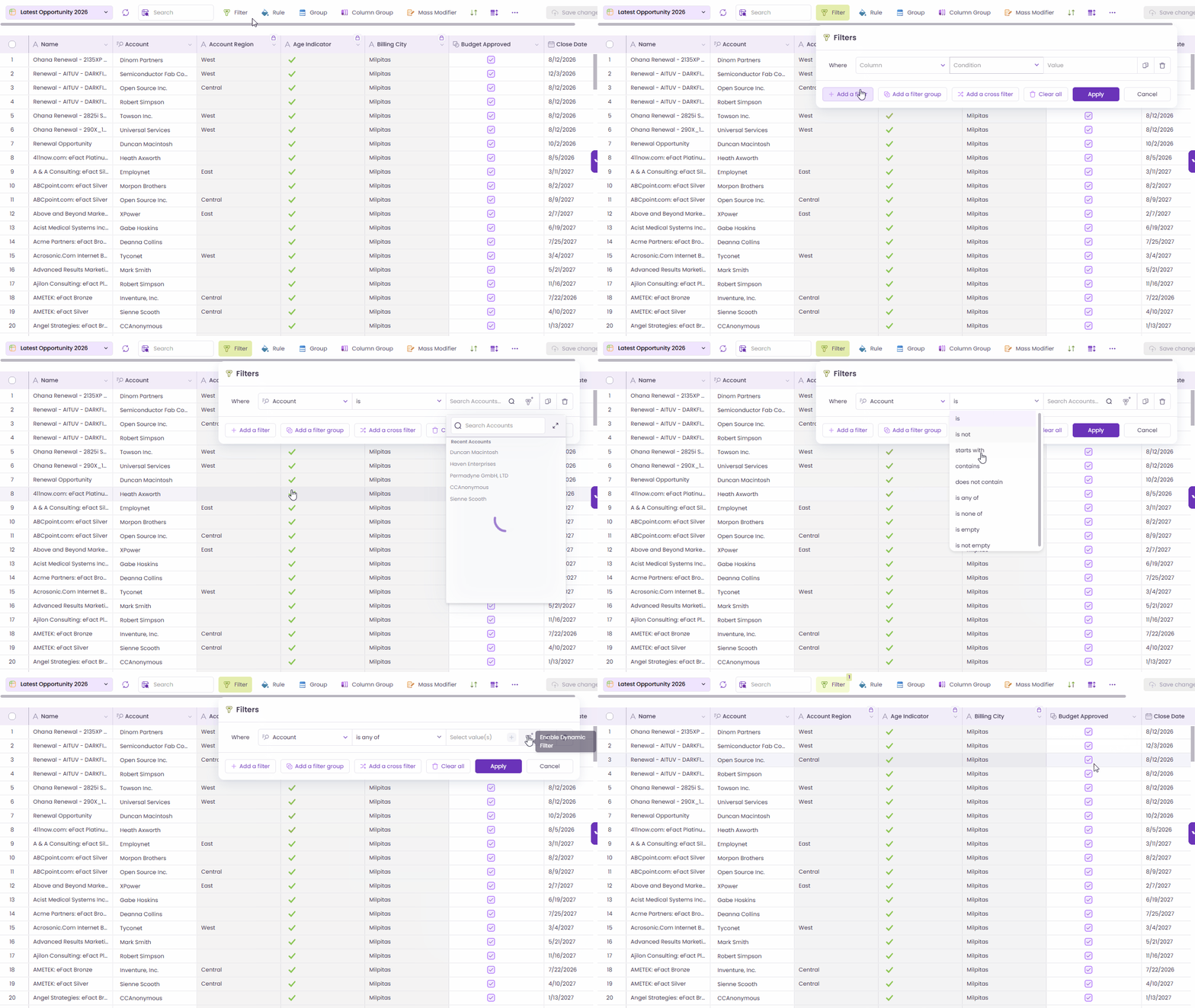
Dynamic Filters now make Valorx Grids more powerful and flexible across Flows, LWC, and Aura components. Grids can accept runtime parameters, pass them back to Salesforce, and dynamically render data based on record context without forcing users to navigate away from their current screen.

Dynamic Filters

Key Highlight

  • Runtime parameter support across Flow, LWC, and Aura

  • Grids can be launched on demand within Salesforce Screen Flows

  • Record context (such as Account ID from an Opportunity) can be passed into the grid as a filter

  • Enables grids to surface data from related but non-hierarchical objects

Common Use Cases

  • Search & Select (Transactional) Launch a grid from an Opportunity to search and select related records (for example, Quotes) for downstream processing.

  • Review & Analysis (Analytical) Open a popup grid to review related datasets (such as Account-level Cases) without leaving the current record.

Business Value

  • Expanded Cross-Object Reach Access related data beyond standard parent-child grid limitations.

  • Seamless User Experience Popup grids keep users in the same record context, eliminating unnecessary navigation.

  • Flexible Configuration Grids can be injected anywhere in a flow — as transactional steps or review checkpoints.

  • Broader Adoption Supports both transactional workflows (pipeline, quoting) and analytical scenarios (review, QA, approvals).

Dynamic Filter with Flow

Current Limitations & Behavior

  • Dynamic Filters support only documented input formats

  • Date filters must use UTC format (YYYY-MM-DD)

  • DateTime values are evaluated and displayed in UTC at runtime

  • Runtime filters don’t render like standard Salesforce filters:

    • IN operator doesn’t show value chips

    • Date fields don’t display a date picker

  • Lookup behavior:

    • Reference lookup fields support record IDs only

    • Lookup name fields support either all IDs or all names (not mixed)

    • Lookup names are not resolved at runtime

Dynamic Filters significantly expand what’s possible with Valorx Grids. It brings powerful, context-aware data access directly into user workflows while keeping the experience smooth and intuitive

Grid Field Configuration

The Grid Field Configuration feature has been enhanced to support advanced column-level controls, including label customization, validation, visibility, editability, formatting, and default values. These settings apply consistently across grid features while maintaining Salesforce data integrity.

Key Highlight

  • Column Rename: Allows designers to rename column labels without changing the underlying Salesforce field name. The updated label is reflected consistently across Filters, Rules, Grouping, Column Grouping, Mass Modifier, Sort, and the Field Selector. Tooltips display the field API name along with the original Salesforce label. Example: Rename Account Name to Company Name

    Column Rename
  • Required: Mark fields mandatory( * ) during data entry. Required cells block save when empty, with a tooltip “Required field.”

    Required Fields
  • Hidden: Hide columns from the grid view while keeping them available for Rules, Sort and Filters. Users can unhide via the Eye icon. Hiding the last column in a group removes the column grouping.

    Hidden Fields
  • Read-Only: Make columns non-editable even if users have Salesforce edit access. A lock icon with tooltip shows “Configured as Read-Only” for read-only fields.

    Read-Only Fields
  • Format Cell Column: Control decimal precision and unit scaling (Kths, Mn) for numeric fields. Display formatting only; underlying data unchanged.

    Format Cell Column
  • Default Values & Static Defaulting: Predefine default values for new records across data types including String, Picklist, Multi-Picklist, Lookup, Date, DateTime, Integer, Currency, Double, Boolean, Text Area, and Percent. Values are editable unless field is read-only.

    Default Values & Static Defaulting

Behavior Notes

  • Designer access is updated; previous designers may lose access to existing grids after implementation.

  • Field configuration is hidden for Global Grids.

This update provides greater flexibility for designers to control how fields are displayed and edited in grids, improving usability, consistency, and enforcement of data entry rules.

Configurable Record Pagination

Pagination has been enhanced across Main Grid, Row Grouping, and Related Lists to give users more control over how many records load by default.

You can now set and save a default page size across grid types, with an improved pagination panel that makes it easier to load more records, zoom into controls, and configure preferences directly from the grid.

Key Highlight

  • Save Default Page Size Set a default page size that applies across Extension and Embedded grids. Preferences are remembered automatically, reducing repetitive setup.

  • Enhanced Pagination Panel A larger, zoom-on-hover pagination control lets you quickly load more records, access preset increments, or open settings via a ⚙️ icon.

  • Quick Page Size Confirmation When you load more records than the default, a smart prompt asks if you’d like to save the new count as your default. This help personalize your experience without disruption.

  • Support Across Grid Types The same pagination experience is now available in:

    • Main Grids

    • Row Grouping

    • Related Lists

  • All Records Option (Optional) Load all records when needed, with a clear warning about potential impact on load time (Not applicable for Row Grouping).

These updates make Record Pagination more intuitive and customizable, especially when working with large records. Designers and users gain better control over how much data is loaded without sacrificing performance or usability. Find out more about Record Pagination here.

Configurable Record Pagination

Matrix – Support Vertical Orientation

Matrix now supports Vertical Orientation for dynamic measures, giving you more flexibility to design layouts that match your forecasting and analysis needs.

You can choose between Horizontal (default) and Vertical orientations, allowing you to optimize readability, reduce column clutter, and work more comfortably on smaller screens. This is similar to the layout options available in Salesforce.

Key Highlights

  • Configurable Measure Orientation Select Horizontal or Vertical directly in the Matrix Designer. The setting is saved and applied automatically at runtime.

  • Cleaner, More Readable Layouts In Vertical orientation, each dynamic measure appears as its own row under the relevant record, and reducing wide tables.

  • Smart Measure Controls Hiding or showing dynamic measures now hides or shows entire measure rows, keeping the matrix clean and focused.

  • Totals That Just Work Each measure row displays its own totals, and hidden measures automatically hide their totals as well.

Vertical orientation gives you more control over how data is presented, making complex forecasts easier to read and compare. Whether you prefer fewer columns, more rows, or better usability on compact screens, this enhancement helps tailor the Matrix experience to how you work.

Vertical Orientation in Matrix

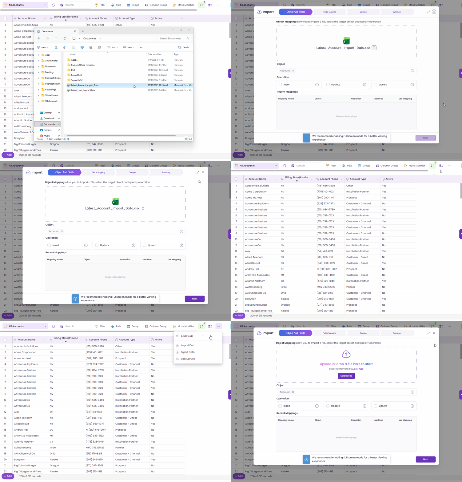
Import Data Directly into the Grid

You can now import data straight into your grid without leaving the Wave Grid screen.

This update introduces a streamlined in grid import experience that lets you upload Excel or CSV files directly from Grid Screen, making data updates faster, simpler, and more intuitive.

Key Highlights

  • Two Easy Entry Points Start an import by:

    • Dragging and dropping an Excel or CSV file anywhere on the grid, or

    • Selecting Import Data from the grid’s menu

  • Guided Import Wizard Both entry points launch the same step-by-step import flow:

    • Object (auto-selected and read-only)

    • Field Mapping

    • Dedupe

    • Summary

  • Context-Aware Importing The object is automatically determined from the current grid and cannot be changed, ensuring imports stay aligned with your data context.

  • Smart Mapping Experience Recent mappings are filtered by object and shown first, helping you import faster with less setup.

Supported Operations

  • Insert – Create new records

  • Upsert – Create or update records using an External ID

  • Update – Update existing records using Record ID

Helpful tooltips guide you through each option during the import process. Find out more about our Smart Import here.

Importing data no longer requires switching screens or breaking focus. By bringing import directly into the grid, this update simplifies bulk data updates, reduces setup time, and keeps your work flowing — whether you’re cleaning data, loading new records, or making quick updates.

Import Data into the Grid

What's New?

New features add powerful capabilities to help you work more efficiently and support new use cases.

Hide & Unhide Columns

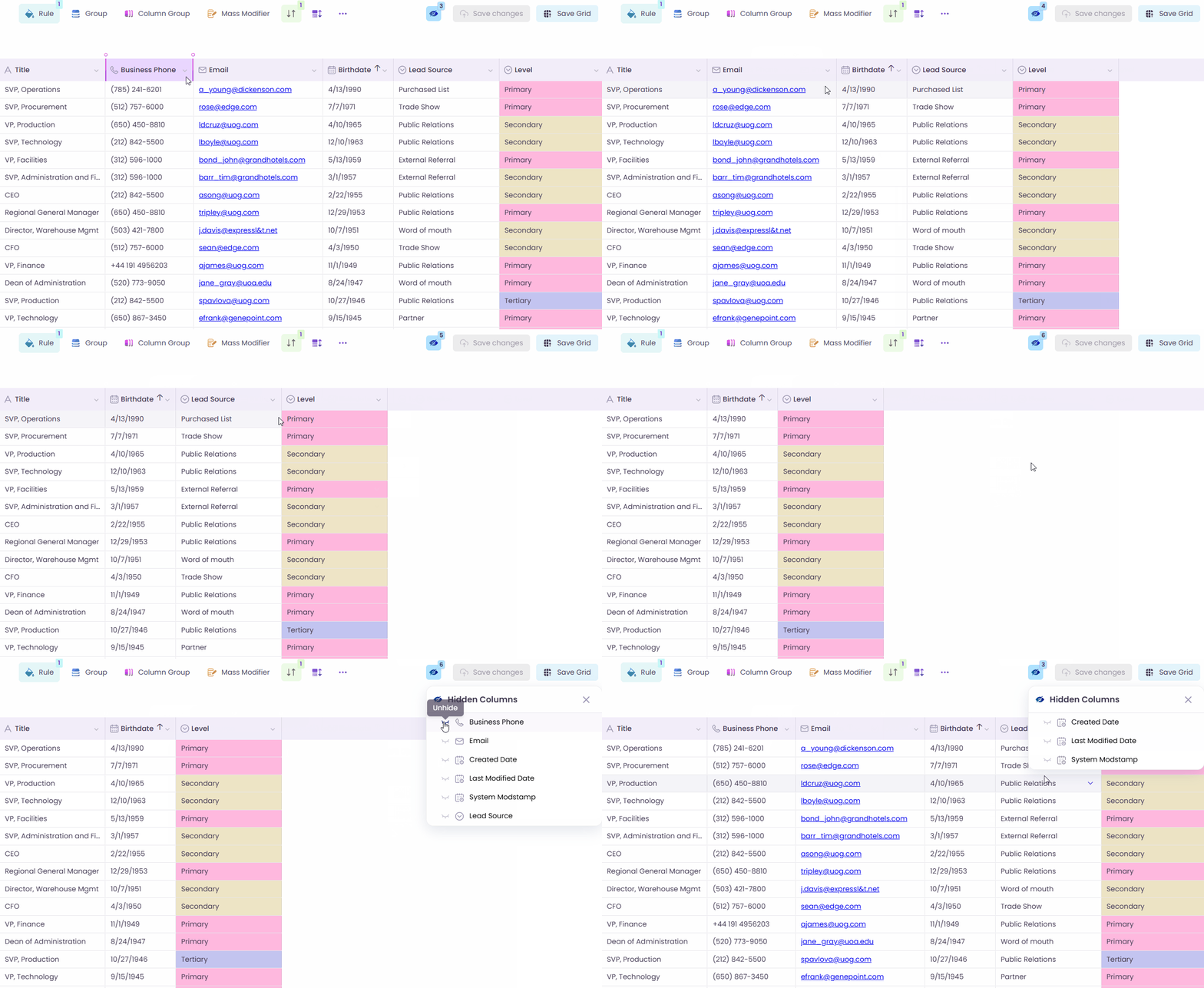
You can now easily hide or unhide grid columns directly at runtime, giving you more control to personalize your grid view — no Designer access required.

This update introduces a simple, intuitive way to manage column visibility using a new Eye icon in the grid toolbar.

Key Highlights

  • Quick Column Visibility Control Hide or unhide columns instantly using the Eye icon in the toolbar.

  • Hidden Columns Overlay Clicking the Eye icon opens an overlay showing only the columns that are currently hidden. Toggle visibility on or off with immediate results — no page refresh needed.

  • Clear Visibility Indicator The Eye icon displays a count of hidden columns, so you always know when columns are hidden.

  • Admin + User Friendly Admins can predefine hidden columns as part of the default grid view, and users can still unhide them at runtime if needed.

This feature helps users personalize their grid views quickly and intuitively, improving readability and productivity without additional configuration steps.

Hide and Unhide Columns

Cross Filter

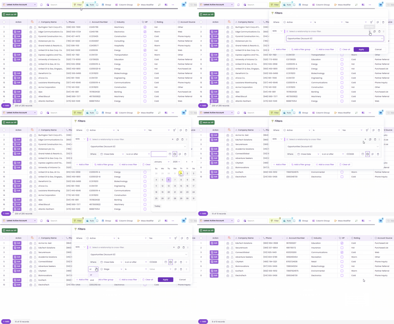
Wave Grids now support Cross Filter, making it possible to filter parent records based on conditions from related lists. This capability is not available in standard Salesforce List Views.

With Cross Filters, you can answer more complex questions and surface the exact records you need, all from a single grid.

Key Highlights

  • New Cross Filter Option Add Cross Filters directly from the Filter alongside existing filters and filter groups.

  • Filter by Related Records Filter parent records based on whether related records:

    • Exist (With related records), or

    • Do not exist (Without related records)

  • Optional Child Conditions Apply detailed conditions on related records using the same familiar filter builder experience — including nested groups and AND/OR logic.

  • Fully Integrated Experience Cross Filters work seamlessly with existing filters, support drag-and-drop ordering, and can be cloned or grouped like any other filter.

Cross Filters close a major gap in Salesforce reporting and list views by enabling powerful, relationship-aware filtering. Teams gain better visibility, fewer workarounds, and faster access to the records that truly matter.

Cross Filter

New Enhancements

New capabilities are introduced to give you greater flexibility and support evolving business needs.

Support Filtering by User Queues

Wave Grid now supports filtering records where the Owner is either the logged-in user or a queue the user belongs to, providing a more complete and relevant view of assigned records.

Key Improvements

  • A new Owner filter option appears for objects that support queues.

  • Automatically includes records owned by queues the logged-in user is a member of.

  • Supports first-level queues only.

  • Filter selection is persisted for future sessions.

  • Available only for objects that support queue ownership.

This enhancement ensures users see all records they are responsible for, including those assigned through queues, improving visibility and reducing manual filtering.

Owner & Queue-Based Filtering

Lookup Picker Support for Polymorphic Fields

The Lookup Picker now supports polymorphic fields in Salesforce, allowing users to seamlessly switch between multiple reference objects such as User and Group (Queue) or Task object fields (WhoId, WhatId, RelatedTo) where applicable.

Key Improvements

  • A reference selector is displayed when a lookup field supports multiple reference targets.

  • Automatically detects and selects the correct reference type when entering edit mode.

  • Fully supported in both collapsed and expanded lookup views.

  • Enables switching between User and Queue for supported objects.

This enhancement improves accuracy and flexibility when working with lookup fields that span multiple reference objects, making it easier to build precise filters and configurations in Wave.

Lookup Picker Support Multiple Reference Objects

Column Grouping
Column Grouping has been enhanced to provide greater clarity, flexibility, and a more polished runtime experience.

We’ve made Column Grouping in Wave more flexible, intuitive, and visually clear. This give you a better runtime experience and more control in the Designer.

Key Improvements

  • Default Open Option Designers can now set “Default Open” for each column group. Groups marked as default open will automatically expand when users view the grid.

  • Smooth Animations Opening and closing column groups now include subtle animations, helping users track grouped data more easily.

  • Cohesive Theme & Multi-Column Support Column groups now support additional columns with a cleaner, less colorful theme for better readability.

  • Improved Labels & Tooltips Updated labels and tooltips make it easier to understand:

    • Group by

    • Grouped columns

    • Color

    • Icon

These enhancements make column grouping more intuitive and configurable, helping users better organize and interpret grid data with improved visual feedback.

Column Grouping

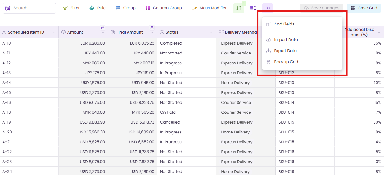
New Actions in Grid More Options Button

We’ve enhanced the grid More Options button () to give you quicker access to common grid actions. Now it is available in both main grids and related grids.

Key Improvements

Main Grid

Now, we’ve added:

  • Add Fields – Open the Field Selector to quickly add more fields to the grid.

  • Import Data – Launch Smart Import to bring new records directly into the grid.

Related Grid The meatball menu is now available in related grids for the first time, with:

  • Add Fields

  • Export Data

These enhancements make it easier to expand, update, and export grid data without leaving the current screen, keeping grid management fast and intuitive.

Grid More Options Menu

Defaulting Behavior for New Rules, Filters, and Column Groups

New Rules, and Filters now include intelligent defaulting to streamline configuration and reduce manual steps.

Key Improvements

  • New Filters: Column dropdown automatically opens when a filter is added.

    Filters

  • New Rules: Column dropdown of the first condition opens automatically.

    Rules

This improvement saves time during setup and makes creating filters, rules, and column groups faster and more intuitive.

Rules UI Enhancements

The Rules interface has been improved for better readability and efficiency.

Key Improvements

  • Editing Rule – Rule can now be edited directly from the rules list.

  • Clearer Labels – “When” and “Then” labels are now bold, making conditions easier to scan.

  • Helpful Tooltips – Hovering over a rule condition shows what the rule applies to, providing quick context without opening the editor.

These updates make managing and understanding rules more efficient and intuitive, so users can configure grid with confidence and less effort.

Rules UI Enhancements

Permissions Tab

The Permissions tab has been updated to improve user access management and provide clearer runtime behavior.

Key Improvements

  • Users Grid now shows only active users with the current user labeled as (you).

  • Valorx Wave User Access column added to indicate user access details.

  • Runtime behavior:

    • Only assigned users can access the grid in the published location.

    • If a licensed user has no access, a message is shown: “You don’t have access to this Grid. Designers can allow access through step 6 or from Wave Dashboard.”

  • Designers who previously had access may no longer have access after this update.

  • Permission Set column now displays Description and Namespace.

  • Save and Surf buttons are disabled if a Custom Users Permission has no assigned user, permission set, or profile.

These enhancements provide more precise control over grid access, improve clarity on permissions, and ensure the runtime experience aligns with actual user access.

Permissions Tab

UI Consistency Improvements Across Toolbar Overlays & Menus

We’ve refined multiple toolbar overlays, popups, and list-based components across Grids and Matrices to improve visual consistency, alignment, and usability.

These updates focus on spacing, icon styling, button sizing, and layout alignment, ensuring a more polished and predictable experience across the application.

Key Improvements

Toolbar Overlays

  • Filter Overlay

    • Updated icon colors for clearer visual hierarchy

    • Standardized button sizes for Copy and Delete actions

    • Improved color consistency across filter groups and dropdowns

  • Mass Modifier Overlay

    • Aligned Delete button styling with other actions

    • Updated icon color and spacing for “Modify another field” action

  • Sort Overlay

    • Refined layout for better consistency with similar UI elements

Matrix Popups & Overlays

  • Record Selection & Search Configuration

    • Progress bar moved to the top of the popup for better visibility

  • Timeline Overlay

    • Standardized label-to-input spacing

    • Increased height of timeline tags (Months, Quarters, Years)

    • Adjusted internal padding for improved balance and readability

Menus & List Items

  • Standardized spacing, padding, item height, icon-to-text spacing, background highlighting, checkmarks, and selection behavior across contextual menus, group overlays, grid and matrix menus, layout menus, add column/row lists, grid picker, search lists, and column grouping popups.

These refinements don’t change functionality, but significantly enhance visual consistency, readability, click accuracy, and overall UX polish and predictability across overlays and menus. Everything now feels more aligned, balanced, and intentional especially when switching between Grids and Matrices.

Grouping by Visible Records for Lookup Fields

Grouping for Lookup fields has been enhanced to better reflect the records currently shown in the grid.

A new option, Group by Visible Records, is now available in the Group popup. This option determines whether lookup group values are derived from the records currently rendered in the grid or from all available Salesforce values (existing behavior).

Default Behavior

Group by Visible Records is enabled by default.

With this option enabled:

  • Group values are derived only from lookup values present in the visible grid records.

  • These values are automatically preselected.

  • A maximum of 50 values can be selected, based on Extension Settings → Max Groups Allowed (Embedded grids default to 50).

  • If the number of unique visible lookup values exceeds the limit, only the first allowed set is preselected.

The confirmation prompt that previously appeared when changing the grouping field or row grouping configuration has been removed, allowing for a smoother and more efficient grouping experience.

Group by Visible Records

Automatic Refresh of Matrix After Save

Matrix grids now automatically refresh all data for the same X and Y axis records after a successful insert or update.

Key Improvements

  • After a successful save, the matrix now fetches fresh data from Salesforce for the affected X–Y record combination.

  • All related measures including formula and roll-up summary fields are refreshed automatically.

Users can see updated measure values instantly, improving accuracy and reducing the need for manual refreshes during data entry.

Automatic Refresh of Matrix After Save

Bug Fixes 🐛

In this release, we have addressed several issues to improve user experience and functionality.

  • Creatable but Non-Updatable Fields Fixed an issue where fields with creatable=true and updatable=false were shown as read-only in the grid, blocking new record creation. These fields now allow record creation as expected, aligning with Salesforce behavior.

  • Lookup Filters with Nested Parentheses Fixed an issue where nested parentheses (( )) in Lookup Filter logic were ignored or evaluated incorrectly, causing unexpected results. Lookup filters now respect the intended logical grouping.

  • Recent List in Matrix Designer Fixed an issue where invalid or unrelated relationship objects appeared in the Recent list of the Object Picker when selecting a new data object. Only valid objects are now shown for the current Matrix configuration.


This release focuses on giving you more control, better visibility, and a smoother overall experience. Whether it’s working with complex data, personalizing your views, or navigating a more consistent interface, these enhancements are designed to support your day-to-day workflows with less effort and greater clarity. We’re excited to keep building on this foundation and look forward to sharing even more improvements in future releases.

Last updated

Was this helpful?