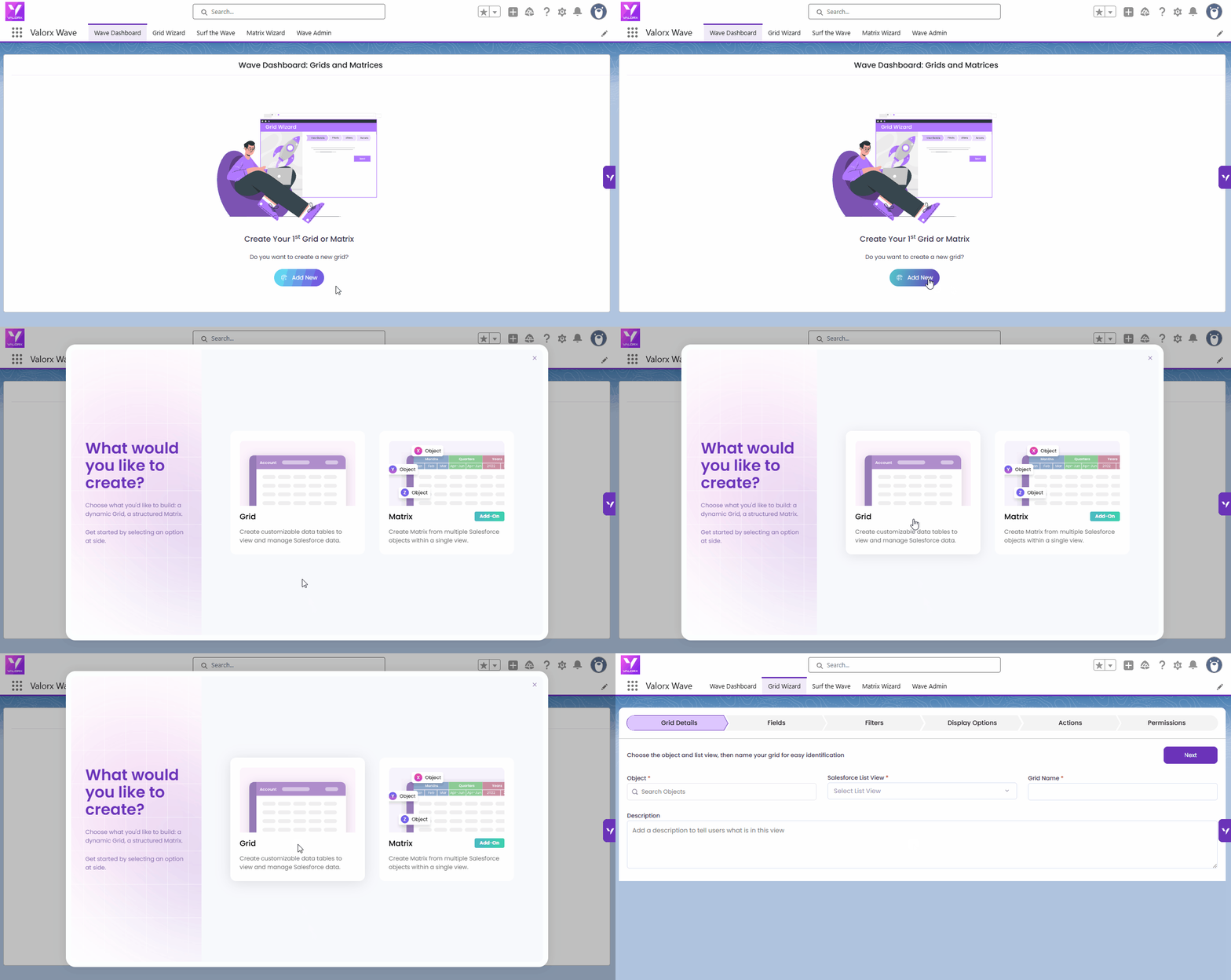
Create a new grid for first-time user
| Step | What you configure |
|---|---|
| 1. Create a New Grid | Start the wizard — first-time or returning user |
| 2. Grid Details | Name, object, and starting point (scratch or list view) |
| 3. Fields | Which columns to show and in what order |
| 4. Filters | Which records to include by default |
| 5. Display Options | Rules, column grouping, related lists, layout, sort |
| 6. Actions | Row-level and grid-level action buttons |
| 7. Permissions | Who can access the grid and what they can do |
| 8. Save & Go to Surf the Wave | Save your grid and switch to Surf the Wave to use it |

Create a new grid for first-time user
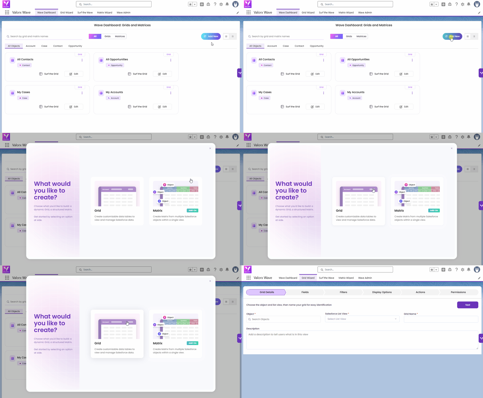
Create a new grid with existing grid
.gif?alt=media&token=ea46bf55-913f-4fd9-bde1-c899c67e220b)
Create a new grid by navigating to Grid Wizard tab.
| Option | When to use it |
|---|---|
| Create from Scratch | You want full control. You'll manually pick and arrange fields in Step 3. |
| Select from a Salesforce List View | You already have a list view with the right fields set up. The grid will pre-populate with those fields, saving you time. |
%20v2.gif?alt=media&token=54ca3720-69c4-44b4-8287-345eccb9793a)
Grid Details
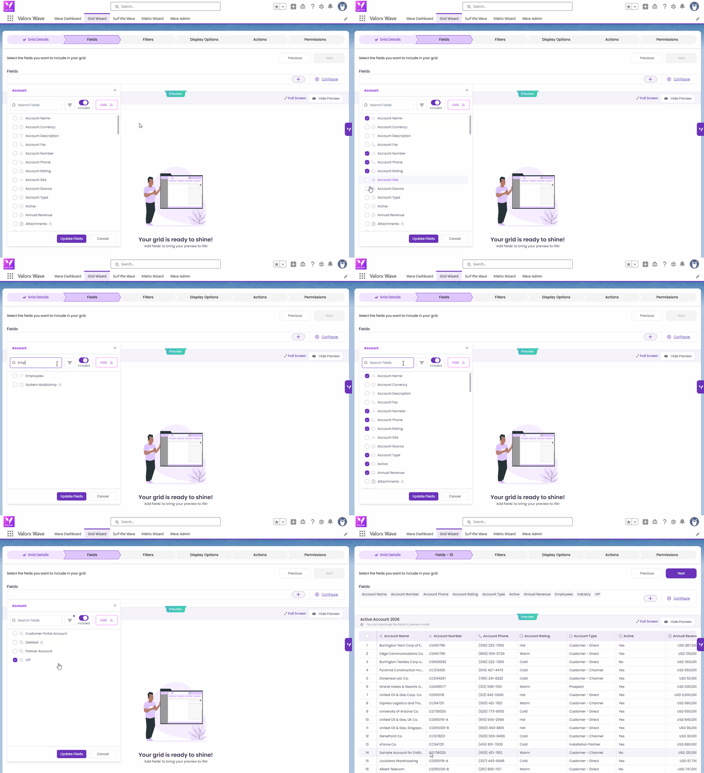
Adding Fields
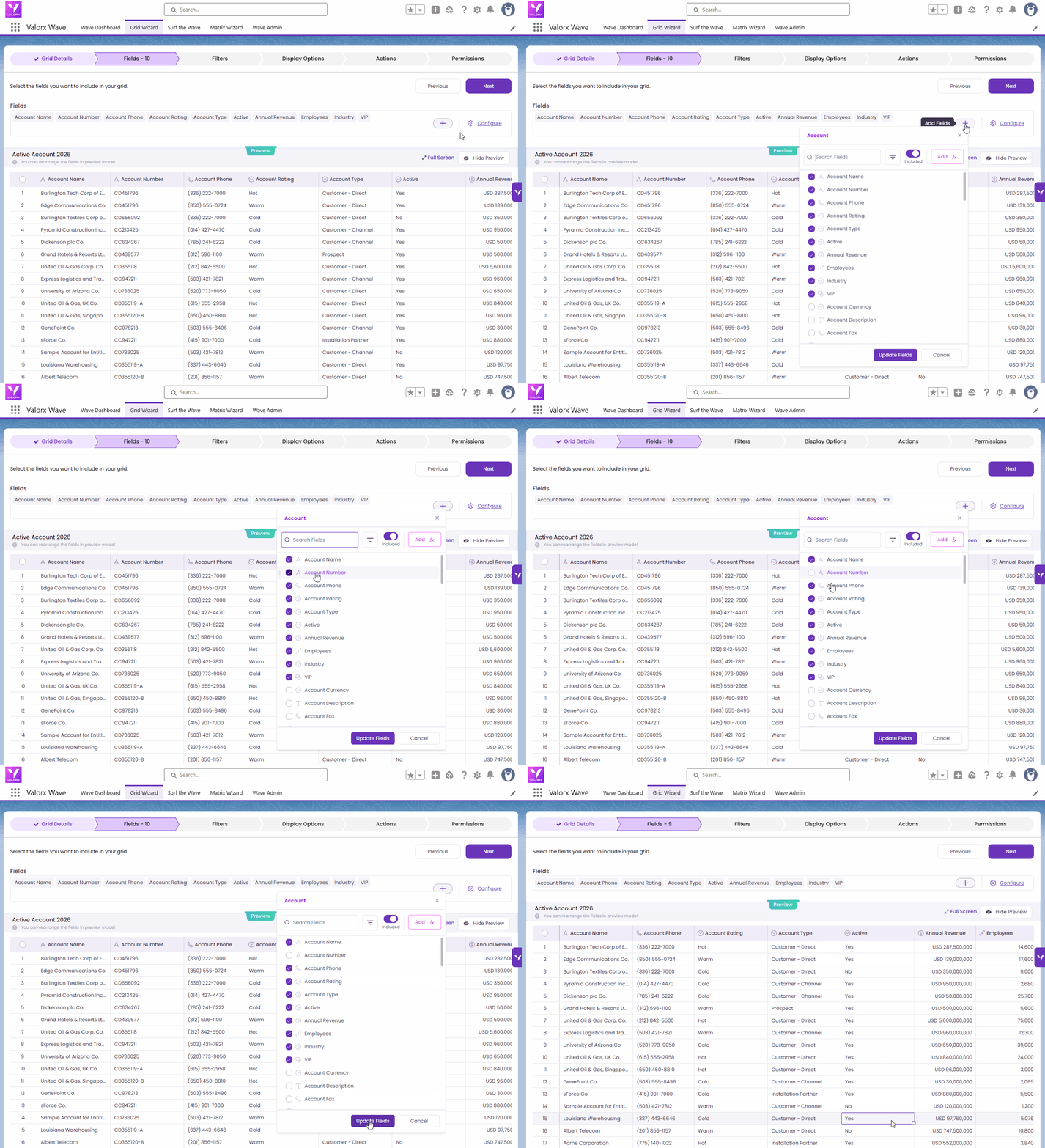
Remove Field
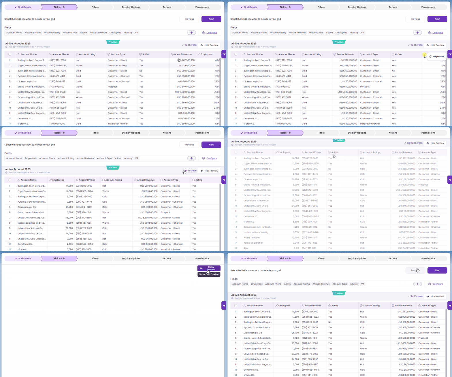
Rearrange Fields

| Filter type | Use this when... |
|---|---|
| Add a Filter | You want to filter on a single field. e.g. show only Accounts where Industry = "Energy". |
| Add a Filter Group | You need AND/OR logic across multiple conditions e.g. show Accounts where Rating = Hot AND Industry = Energy OR Construction. |
| Cross Filter | You want to filter parent records based on their related child records e.g. show only Accounts that have at least one open Opportunity. This is not available in standard Salesforce List Views. |
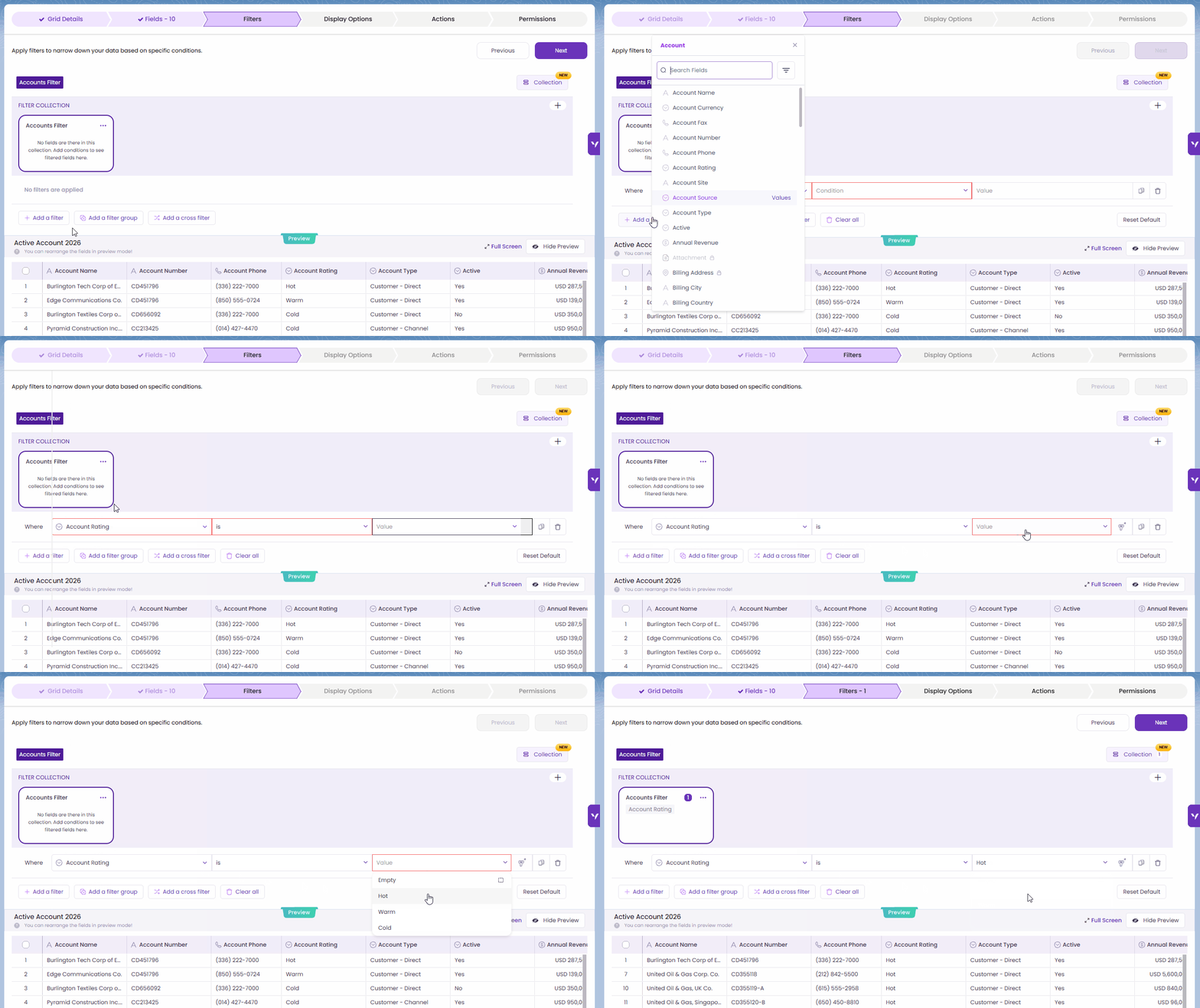
Add a filter

Add a filter group
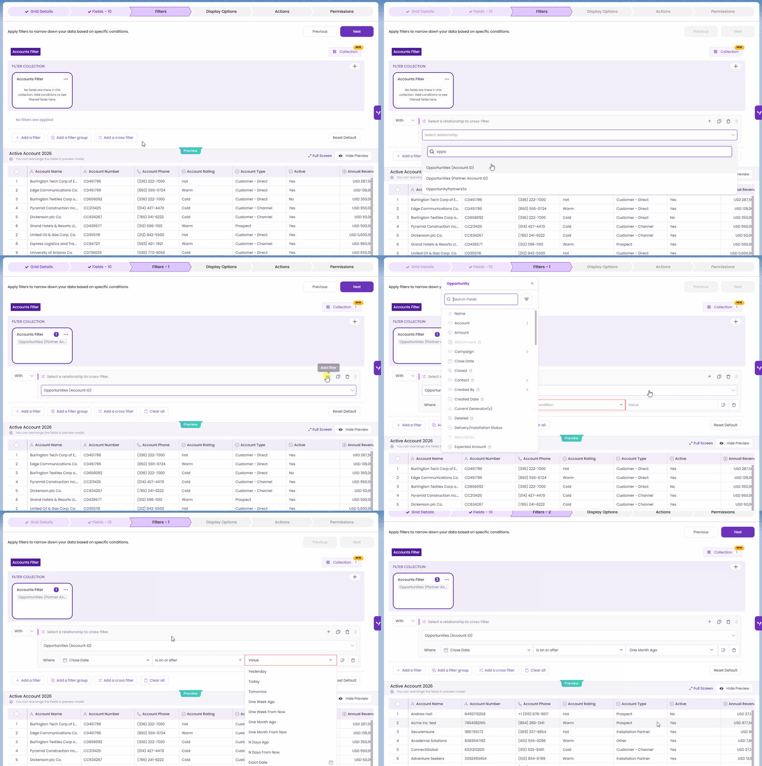
Add cross filter
| Dynamic | What it resolves to |
|---|---|
| Current User | The Salesforce user who is viewing the grid |
| Today | The current date at runtime |
| This Month / This Quarter / This Year | The current calendar period |
| Current User's Role | The role of the logged-in user in Salesforce |
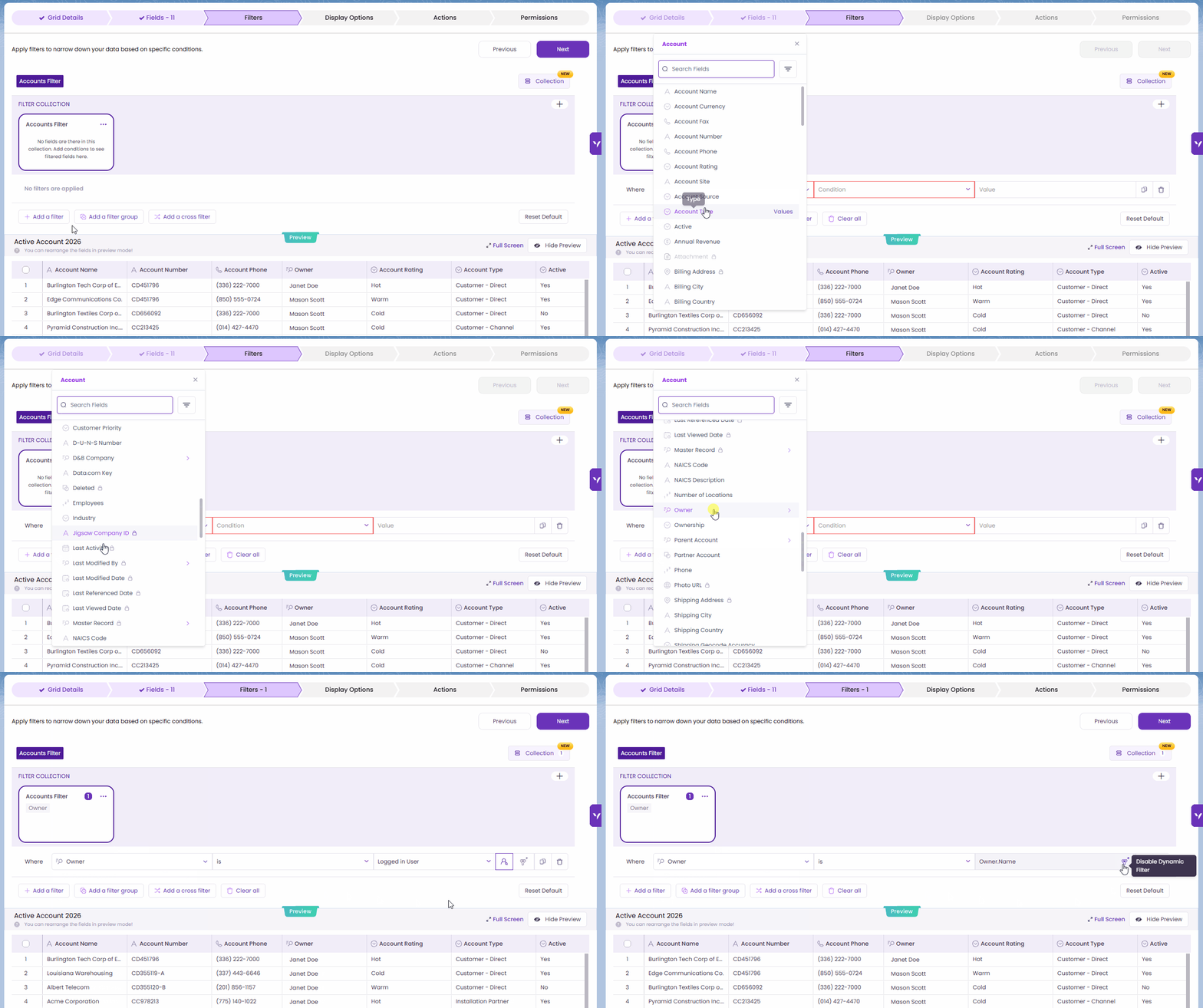
Dynamic Filter
| Example |
|---|
| You are building an Account grid and want two separate filtered views: |
| Collection 1 — Hot Accounts: Filter: Account Rating = Hot |
| Collection 2 — Cold Accounts: Filter: Account Rating = Cold |
| Each collection is independent. At runtime, selecting "Hot Accounts" applies only those filters. Selecting "Cold Accounts" instantly switches the entire filter configuration. |
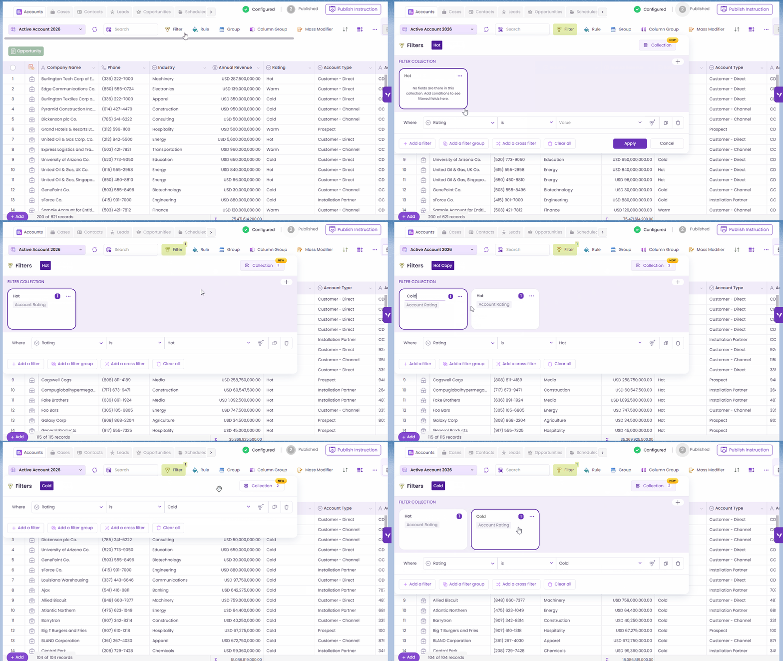
Filter Collection
| Action | How it works |
|---|---|
| Rename | Update the name directly in the Filter Collections section. Names must be unique and cannot be empty. |
| Duplicate | Create a copy of an existing collection. The duplicate will include "Copy" in its name. |
| Delete | Remove a collection and all its filters. Note: at least one collection must always remain. The last collection cannot be deleted. |
| Switch | Click a collection name to activate it. Its filters apply to the grid immediately. |
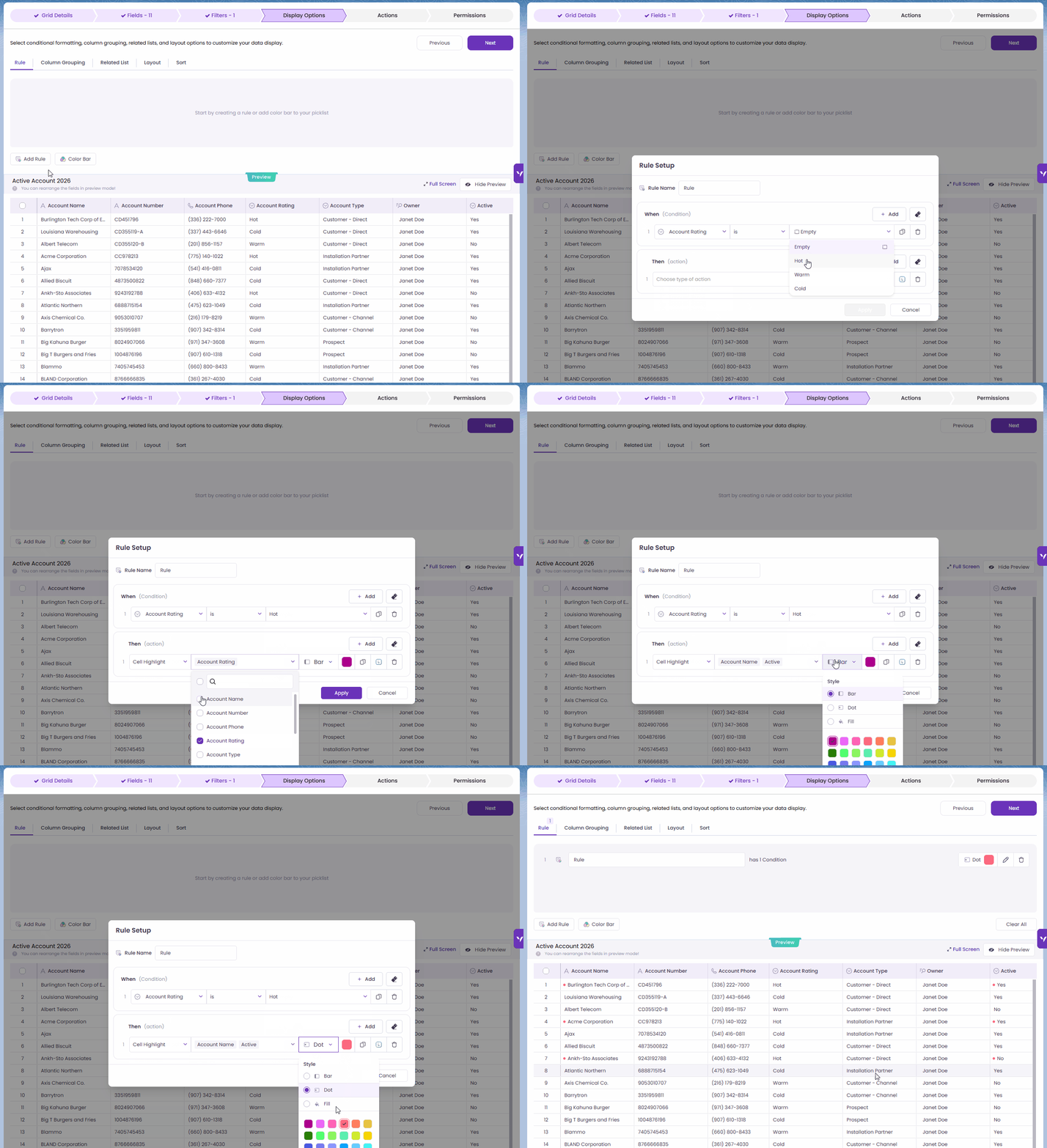
Apply Rule

Add Column Grouping
.gif?alt=media&token=ee634579-434d-4fec-862a-8df513e7e684)
Add related list

Full-Screen Overlay

Limit

Reorder Related List

Tooltip Support

Configure grid's layout

Sort

Add and Customize an Action Button

Select Action Type and Configure Return Settings

Add Variables and Finalize Configuration

Configure the Action column position on the grid

Combined Row Action

Add and Customize a Grid Action Button

Select Action Type and Configure Return Settings

Add Variables and Finalize Configuration

Users
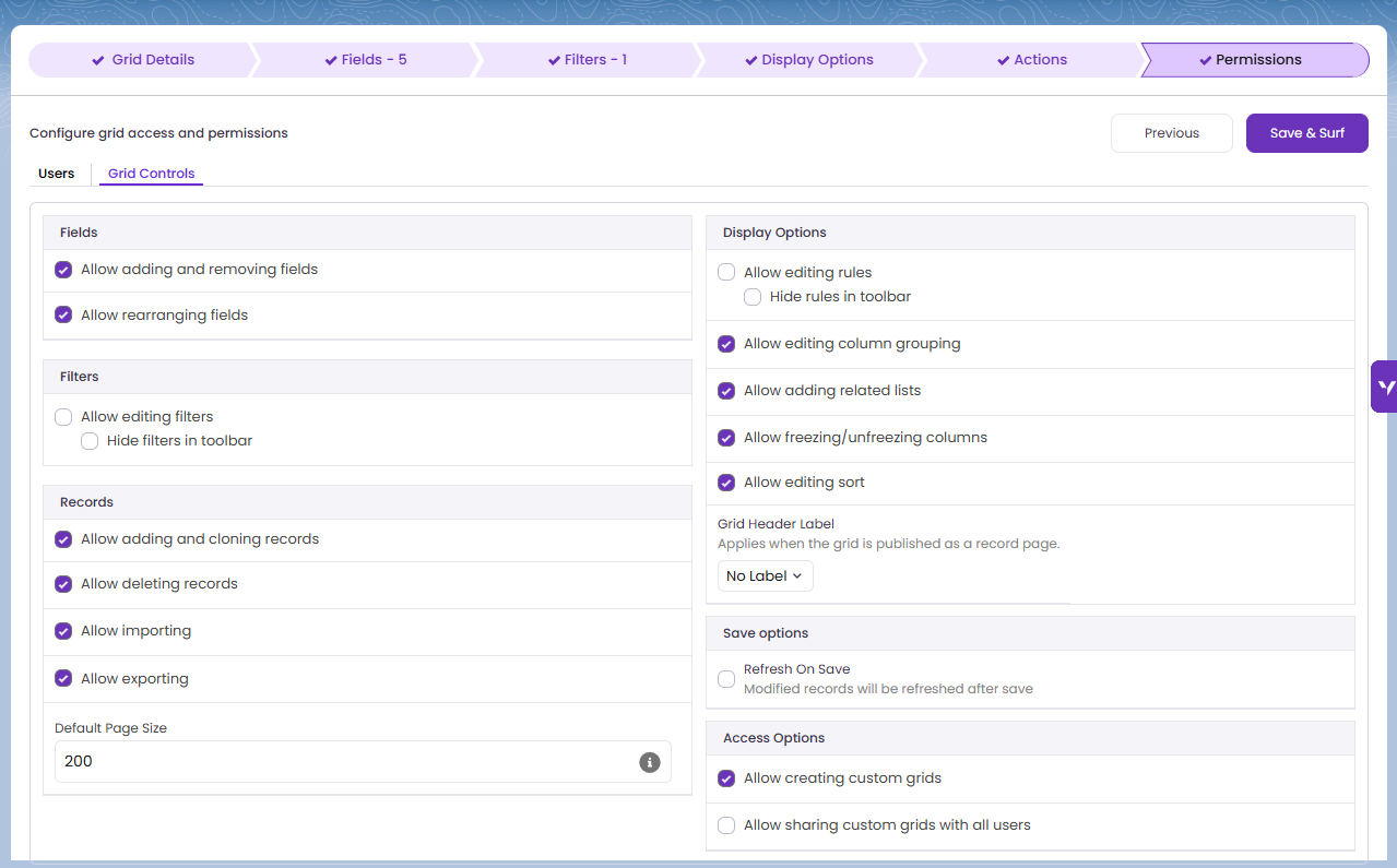
Grid Controls

Toolbar when “Hide rules in toolbar" is enabled

Toolbar when “Hide rules in toolbar" is enabled

Object Plural Name

Grid Name

No Label

Grid Controls: Access Options

Save and Surf